Some Fresh Content Layouts to Spice Up Your Videos
We’ve all been there. You’ve learned enough about PowerPoint to create a decent set of slides for a video. You know how to format a nice gradient background and how to choose images. Maybe you know a thing or two about fonts. But after a while all your slides start to look alike. Some text on the left and a picture on the right. Not bad but after a while-  Booooooooring. Let’s do something about that shall we?
There are only a limited amount of layouts available in PowerPoint: Title with Content, Picture with Content, Two Picture and a few more.
What you really need to do is choose the Layout that is called “Blank” so you can do your own thing from the start.
One of the best ways to get some ideas for layouts is to either go to Slideshare.net or over to Canva.com If you go to Canva you can click on their layouts button and see all sorts of examples of layouts. In fact, the three below I made over at Canva and it took me about 5 minutes each. You could actually create your entire slide deck there, but the problem for me is that I like to add animation to my slides and you can only download your creation as an image or a pdf. But it is a great place for ideas.
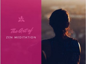
PowerPoint Layout Idea 1-Full Photo with Transparent Shape
This kind of a layout is created by having the image as large as the slides. Then, create a rectangle shape (or any shape if you want to be edgy) and choose a color that coordinates with the photo.  It’s probably hard to see it in this blogpost but the photo behind it is peaking through nicely. To create this effect you can make the rectangle shape transparent by going into Format Shape and making the fill color about 50% transparent. It’s a great way to use text on top of an image without completely losing half of of your image.
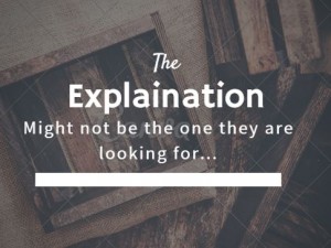
PowerPoint Layout Idea 2-Full Photo Colorized with Text on Top.
This is a great way to use a photo that may be less than perfect or one that just gives a theme or feeling to your slide. As in the example above-try filling up the frame with the photo. 
To get the look you see on the right, I double clicked on the photo, went under the Format menu, chose the Color menu and picked a very dark color and saturation. The bold white text looks great against this background, don’t you agree?
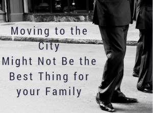
PowerPoint Layout Idea 3- Place Text in an Area of Your Photo that is Mostly Empty
It may take just a bit of extra hunting but you can usually find a photo that has an empty area that would be perfect for your text.  Don’t feel like you have to use the entire photo either. There is nothing wrong with hanging some of the photo outside of your PowerPoint slide where it won’t show up in the final video. I like how mysterious this looks. Just who ARE those people in the shot?
Using the blank layout and having your images fill up the slide gives the slide more impact and evokes more feeling than the simple title, text and small photo that we normally see. Now it’s time to experiment a bit on your own and see what new layouts YOU can come up with.
