The Top Four Graphic Skills Video Creators Need Now
I’ve mentioned repeatedly in our weekly Screencast Video Coaching webinars how poor my graphic skills have always been and, as a video developer, how badly I (Michelle) wish I’d been born with a better eye for visual design. But over the years I’ve been able to compensate for this lack of natural talent by studying and taking training.
In fact I’ve spent a lot of time, lately, really analyzing other people’s design and branding and taking design classes from people who I believe have great talent but are also good trainers.
My friend, Angela Wills, has that mix of good graphic instincts as well as a way of sharing her ideas that make you feel like you can really learn this stuff and it’s not just about having an inborn gift for being visual.
I asked Angela if she could share her thoughts on the most important graphic design skills for Screencast Video Creators and also give away something to our readers that will help them find good resources for their videos. I’m sure you’ll enjoy it and don’t forget to download her free guide at the end.
You put a heck of a lot of work into your videos and obviously you want people to SEE them.
Videos are a very visual medium and once you’ve got people watching and “hooked” they’ll see it through. But how do you get people to even click play on a video, or before that click through to see what it’s about? How do you generate enough interest to grab their attention?
That’s key. It’s not enough to just pop up a screenshot of the first slide of your video, or even some interesting looking section. Even though a screenshot like that might mean something to you it means next to nothing to almost anyone glancing through your page, on facebook, etc, to see if your video is worth taking their time to watch.
That’s why you need Graphics! You know you need them. You don’t want to pay a fortune to get them for your videos. You don’t want to spend eons of time to create them. So what to do? Develop these four basic graphics skills to sell more video products and get your videos viewed. These are skills you can use again and again to promote your business and get more eyeballs to your material.
Here they are:
- eCover Creation: Nothing does a better job of representing your product than an eCover. How many stores have you walked into lately where they were selling products without packaging? Um… none, right? That’s because packaging works. eCovers are packaging for your digital products and it’s really not a question of whether you should have them, you should. People need a visual on what they will receive when they invest money (or time) in your information. That visual could be the difference between them jumping on board excited as heck or walking away unimpressed. eCover are not nearly as hard to create as you might thing. With the right tools and some awesome templates you can create highly professional looking eCovers within minutes.
- Facebook Ad Graphics: You’re spending good money to get people to your webinar or buy your product. Are you using bad looking images or graphics with that good money? I sure hope not! You want to really up your game here and create sharp, clear ads that attract attention. It’s not as difficult as you think and you can actually learn a ton from studying the ads out there right now. Of course you have to have a few good tools up your sleeve to create a good ad. Things people don’t think of include font type and placement, color choices and copywriting. This can all be learned!
- YouTube Graphics: Remember I mentioned that it’s not a good idea to promote your video with a screenshot (aka Thumbnail)of said video because people won’t know what that means? Well if you place your video on YouTube you know that’s exactly what happens. You want to create a much more engaging image that gets people to click! Entirely doable. Also having a great header image on YouTube and knowing how to update it will help you keep the attention of your market.
- Powerpoint Graphics: No presentation looks good as a mish-mosh of images and content. When creating your PowerPoint Videos you’ll want a very consistent look and feel to what you’ve created. Understanding how and where to source great stock videos and icons for your videos is a key and base skill to creating beautiful and effective branding for your video content.
Get these four pieces right and you will have a very cohesive look for your videos AND your business. People will understand what you have to offer and will see the visual cues to suggest that it’s right for them, right now. Don’t put all that work into your videos and then just leave the promotional part to chance. Get these base graphics skills down and get maximum exposure to that high quality info you worked hard to create!
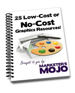
And to get you started I’d like you to have my free Guide.
You’ll get immediate access to over 25 low-cost or no-cost web graphics resources and you’ll learn how to get further learning to create graphics for your business, when you need them. No more waiting or going without the graphics you need!
BONUS: I’ll share my favorite way to get the BEST stock photos for free!
Thanks for reading,
Angela Wills


