Some Common Mistakes with your Visual Design
I was working with a coaching client the other day. We reviewed his first attempt at a training video. For this review, we focused on the video’s visual design.
Overall, he did a great job, especially for someone just starting out. However, he made some mistakes that are common to many of the videos I see. I thought I’d do a quick rundown of what they are and provide some tips on how to prevent them.
1. Not Considering the Impact of the Visual Design
Good visual design is as much about visual communication as it is about message content.
Everything you add conveys a message, whether it’s your intention or not.
You’re video is a story. The content design and structure is part of it. But are you committed to a visual design that reinforces the key message and emotions?
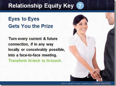
An Example of Good Visual Design.
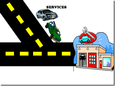
2. Graphics Don’t Match
My student’s video had some really nice use of photos to support the course. However, there were some places where he used vector images and clip art. While they weren’t superfluous and did fit the context of the course, they just didn’t seem to belong to it. Use graphics that belong together. It also conveys a sense of professionalism. You want your graphics to look like they belong together and are part of a whole.
Even if you’re stuck using clip art, you can find images from a similar style and then modify them to fit together.
The Slide Below Shows Clip Art that Doesn’t Seem to Go Together
3. Misuse of Fonts
I’ve seen some videos that must use about twenty different fonts.
Fonts serve a few purposes. First, they’re used to display text for reading. That means you have to consider which font style is going to work best on your screen. It has to be the right type of font and the right size. In most cases, a san serif font works best for the computer screen.
Fonts also should fit into the overall theme and design of your video. If you’re doing a traditional or serious video, Comic Sans probably isn’t your best bet. At the same time, if you want to set an informal tone, you’ll probably stay away from something like New Times Roman (unless you’re a financial analyst).
So you should view the fonts on the screen as text that is to be read AND as a graphic the communicates additional meaning.
In the image below the fonts don’t blend together, are hard to read.
Remember:
It’s not about just making the screen look good. Visual design sets the tone for the video and that shouldn’t happen by accident. Everything on that screen communicates something. It’s your job to make sure that it’s communicating what you want it to.


